
Redesigning and Branding the National Park Service App
Timeline: 7 Weeks
Team: Myself, Leela Aji, Ava M, Kendrick Ma
Role: Interface Design | Protoyping | User Flows


OUR GOAL
In a short timespan our goal was to provide the NPS app with a fresh new interface that felt more closely related to their other in park brand assets. We chose to focus in on a few main features to revamp that felt most essential to users for this in class project.
The problem
An Abundance of Information
Dense categories
Information is not given the proper hierarchy. With everything given equal attention, it can be hard to hone in on specifics.
No main user flow
There are too many subpages to get lost in, and without a flow to help orient, it becomes easy to lose the page you had up.


TO BEGIN
As we continued looking through Casa Sheilas materials, we found a immediate disconnect. The current site and branding (or lack thereof) is impersonal, bland, and uninspired. While exploring their large collection of photos, it became clear that the non-profit is anything but that, it's a colorful and rich experience. This is where we started.

Their Navigation
Our Navigation
INSPIRATION
Exploring assets from the parks like their signage and phamplets helped us narrow in on an identity that still felt connected to the NPS brand.

Bold Sections

Yellow Wildlife Signs

Familiar Nostalgia
We wanted a visual identity visitors can trust, a virtual pocket guide.
*
Confident
Like the park guides we've drawn inspiration from, we want our app to feel just as navigable and information-rich.
*
Informative
The parks are rich in history and wildlife, and knowing the history and daily updates helped visitors feel up to date and part of their surroundings.
*
Inspirational
One of the most amazing aspects of our national parks are their ability to reconnect everyone with nature. Learning about what makes each park special is a vital part of our goal.
MOODBOARD

Home Page
The introductory page has been simplified. Important updates are displayed clearly on the front page and the users location prompts a varying selection of parks being displayed at the front.
When scrolling there are clear articles pertaining to various park events and when inside a park, there is specific information on trails, events, news, animals, etc.
Search
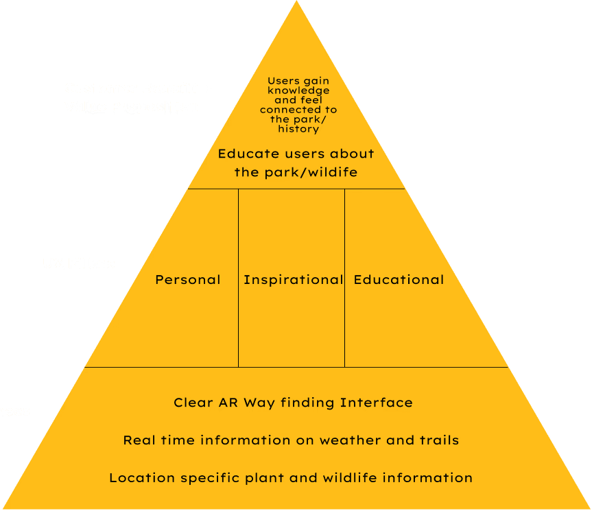
Exploration is at the heart of our National Parks, to improve this experience for visitors, we implemented a tool that not only allows visitors to see the top down view of trails but also real time guidence.
The AI integrated into the system will look at photos taken and provide an informative guide, just like the type of real time education park rangers are able to give. When on a trail, visitors can also use their camera as a guide to show directions and areas where there have been recent animal sightings and more!